As non-face-to-face video meetings have become commonplace in recent years, more and more people use Zoom to conduct multi-person video conferences. A phenomenon called Zoom fatigue is also attracting attention, and this is a new word that refers to the phenomenon of getting tired easily after long conversations with UX filled with each person with squares. The main reason is that each person's background is different, which distracts attention and gives users too much unnecessary information.
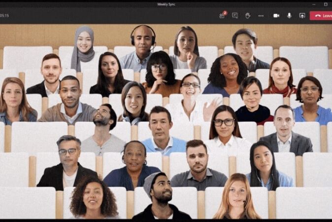
Microsoft says that a more realistic UX is needed to mitigate this phenomenon, especially by removing the background of each person and allowing them to share a virtual space to reduce visual fatigue.
Shared Links is the new Together mode for video conferencing in Teams, Microsoft's chat app. Basically, you can think of Zoom, but after separating only the human part away from the UX that used to represent each person with a square, it is densely placed in a configurable virtual space (e.g. lecture room). There is a z-depth for each placement position, so if you wave your hand, the person behind you is covered. In fact, seeing the demo featuring dozens of people, I feel that the readability is improved a lot more than I thought.
If the screen of Zoom filled with squares was like watching a CCTV, the people placed in the classroom felt more like a real world. Non-face-to-face meetings that break spatial limitations due to corona are active. It may not be difficult to implement the “function” of “breaking the spatial limit”, but it is not easy to implement the “reality” or “sensibility” of “making it as if there is no spatial limit”. I think that technology that combines AI, VR, AR, and UX to make you feel as if you are actually in that space is the final goal of the meeting.
I think it is an example that makes you feel that the technology used is not necessarily useful when it is complex, and it is often the opposite.


